# 三栏布局的实现
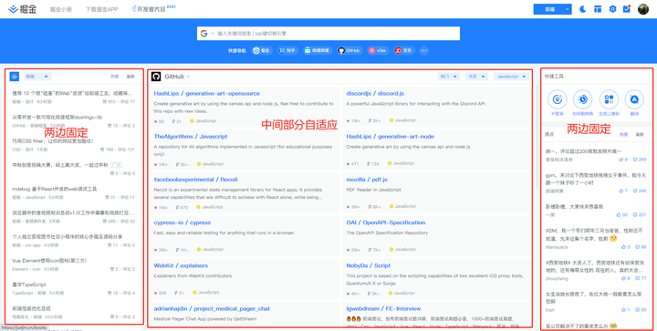
页面中一共有三栏,左右两边宽度固定,中间自适应的布局。
# 1、flex 布局
左右两栏固定宽度,中间一栏flex:1
.box{
	display:flex;
}
.left{
    width:200px;
    background:red;
}
.center{
    flex:1; /*flex-grow(放大比例,默认位0) flex-shrink(缩小比例,默认位1) flex-basis(分类剩余空间之前,占据的主轴空间, 浏览器根据这个属性,计算主轴是否有多余空间,默认值auto)*/
    background:plum;
}
.right{
    width:200px;
    backgrouund:blue;
}
1
2
3
4
5
6
7
8
9
10
11
12
13
14
15
2
3
4
5
6
7
8
9
10
11
12
13
14
15
# 2、绝对定位
父级设置相对定位,左边元素绝对定位,固定宽度;中间设置左、右两个方向margin值;右边元素绝对定位,固定宽度,上、右两个方向为0;
.box{
	position:relative;
}
.left{
    position:absolute;
    width:200px;
    background:red;
}
.center{
    margin-left:200px;
    margin-right:200px;
    background:plum;
}
.right{
    position:absolute;
    width:200px;
    top:0;
    right:0;
    background:blue;
}
1
2
3
4
5
6
7
8
9
10
11
12
13
14
15
16
17
18
19
20
2
3
4
5
6
7
8
9
10
11
12
13
14
15
16
17
18
19
20
# 3、圣杯布局
基本思路:包裹在最外层div预留出左右两边padding的值,随后为三栏设置宽度和浮动,center宽度设置100%,占据整行;使用margin-left:-100%和相对定位,来使left盒子相对于上级元素移动到预留左边位置;right盒子则设置margin-right负值,使其紧随center移动到右边位置。
<body>
    <div id="container" >
        <div id="center" class="coulmn">中间区域</div>
        <div id="left" class="coulmn">左边区域</div>
        <div id="right" class="coulmn">右边区域</div>
    </div>
</body>
1
2
3
4
5
6
7
2
3
4
5
6
7
body{
   min-width: 500px;
}
#container{
   padding-left: 200px;/*左右两边预留空间*/
   padding-right: 150px;
}
#container .column{
   float: left;
}
#left{
   width:200px;
   margin-left: -100%;/*将left放置到预留出来的位置上*/
   position: relative;
   right: 200px;/*在原来的基础上左移200px*/
   background: red;
}
#right{
   width: 150px;
   margin-right: -150px;/*因为前面用过了-100%;所有这边只需要相对宽度移动位置*/
   background: blue;
}
#center{
   width: 100%;/*根据浮动的特性,由于center的宽度为100%,即占据了第一行的所有空间,所以left和right被“挤”到了第二行。*/
   background: yellow;
}
1
2
3
4
5
6
7
8
9
10
11
12
13
14
15
16
17
18
19
20
21
22
23
24
25
26
2
3
4
5
6
7
8
9
10
11
12
13
14
15
16
17
18
19
20
21
22
23
24
25
26
# 4、双飞翼布局
基本思路:将left、container、right共同class设置左浮动,container宽度100%占满整个宽度,container内center盒子margin左、右两侧留出固定的空间,用于存放左右两栏;左边栏left固定与center相同的宽度,margin左边 -100% ,让其到最左边;右边栏固定与center相同的宽度,margin左边 -相同宽度。
<body>
    <div class="container column">
        <div class="center">22222222</div>
    </div>
    <div class="left column">111111111</div>
    <div class="right column">33333333</div>
</body>
1
2
3
4
5
6
7
2
3
4
5
6
7
body{
     min-width: 550px;
}
.container{
     width: 100%;
}
.column{
     float:left;
}
.center{
     margin-left: 200px;/*预留左翅膀*/
     margin-right: 150px;/*预留右翅膀*/
     background: yellow;
}
.left{
     width: 200px;
     margin-left: -100%;/*移动到左边预留位置*/
     background: red;
}
.right{
     width: 150px;
     margin-left: -150px;/*移动到右边预留位置*/
     background: blue;
}
1
2
3
4
5
6
7
8
9
10
11
12
13
14
15
16
17
18
19
20
21
22
23
24
2
3
4
5
6
7
8
9
10
11
12
13
14
15
16
17
18
19
20
21
22
23
24
← BFS CSS两栏布局的实现 →